Spigen Tutorial Video Library
Revamped the video library website of Spigen for product installation guidelines.
Overview
I revamped Spigen's product installation video library to improve tutorial access flow and ensure mobile-friendliness.
Contribution
UX/UI Design
Interaction Design
Team
Amy Lee (UX/UI Designer)
Jason Kim (Director, PM)
Steve Cho (Engineer)
Timeline
3 Months,
Updated in September 2023
Table of Contents
How This Project Started
Project Objective
Stakeholders requested our team to redesign Spigen's video guideline website as the product categories expanded and the site needed a new structure to accommodate newly added product videos. Our objective was to revamp the website with clear categorization and a user-friendly interface.
Understanding User Pain Points
Usability Testing
We invited five users for usability testing and asked them to show us how they would find a guideline for installing a glass protector for an iPhone.
Tasks
Activity #1A: Using the provided product package, find out how to install it on iPhone 13.
Activity #1B: Use the install.spigen.com website to look up the guide video.
key takeaways
Three out of five participants had difficulty finding the way to get to the video guideline website. The QR code paper insert that leads to the website is not noticeable. I learned that both the website and the presentation of the QR code need improvement.
Inside the category page, participants were confused about which video was the right one due to the absence of compatible product indications and the similarity in thumbnail images.
Design Solutions & Theories
Solution for Each Problem
Here are the solutions I developed for each problem identified through user research, based on Jakob's Ten Usability Heuristics and principles of human psychology.
It’s unclear where to click to find what users need.
Solution
Intuitive and simplified categories.
as-is
Too many separate category pages without clear visual cues of related categories can cause confusion as the product line expands.
to-be
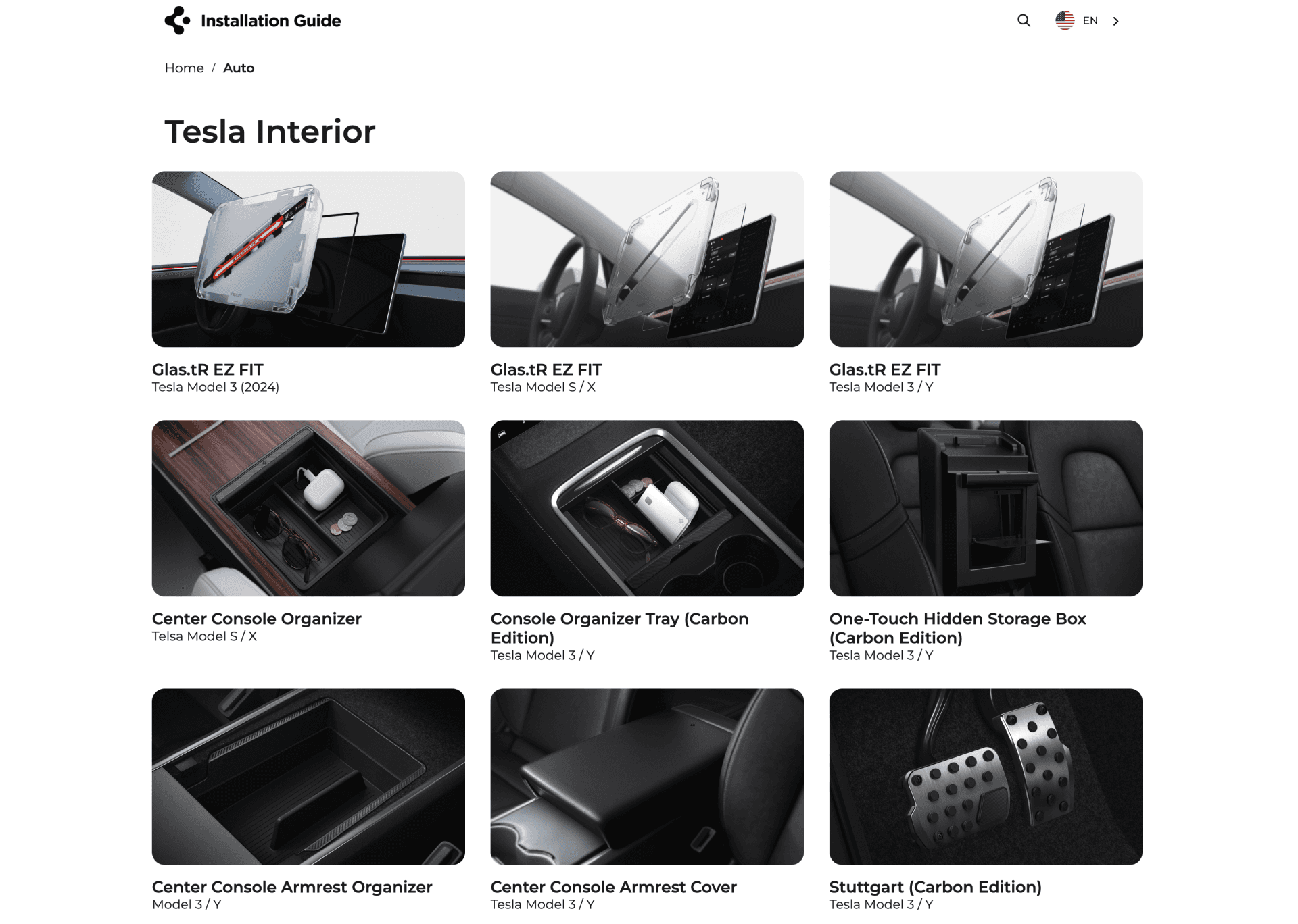
Grouped categories into larger sections with intuitive images and added borders around each category button for clarity.
Applied theories
Gestalt Principles - Law of Proximity
The indication of categories was weak and not intuitive. I applied clear borders for each category to strengthen the similarity among grouped objects.
Requires a high memory load from users.
Solution
Clear indicators for the current location.
as-is
Lack of a category header on a category page forces users to remember their previous selection, causing inconvenience.
Breadcrumb navigation on each page clearly shows users their current location and allows quick access to previous pages.
Applied theories
Visibility of System Status
Designs should keep users informed about what is happening and where they are. I added breadcrumb navigation to indicate to users where they are and allow them to go back to the specific hierarchy of pages.
Poor readability and visibility.
Solution 1
Improved mobile readability.
as-is
to-be
Applied theories
Fitts's Law
To minimize time it takes for user to select a thumbnail, I increased text and image sizes and enhanced mobile experience.
Solution 2
Enhanced visibility of search box.
as-is
to-be
Applied theories
Gestalt Principles - Principle of Figure-Ground
The white search box blended into the white background, making it hard to see. Added a dark banner behind the search box to increase contrast.
Validating Design Effectiveness
Usability Testing
After the design update, we tested its effectiveness on three participants by asking them to perform the same activities we tested before the revamp for a clear comparison.
Recording of One of the Participants
result and insights


