Spigen Website
Redesigned e-commerce product listings and descriptions.
Overview
The project focused on redesigning Spigen's e-commerce website product listings and descriptions to make online shopping seamless across all devices. The goal was to improve the shopping experience and make it more mobile-friendly.
Contribution
UX/UI Design
Interaction Design
Team
Amy Lee (UX/UI Designer)
Aiden Kim (UX/UI Designer)
Jason Kim (Director, PM)
Steve Cho (Engineer)
Timeline
6 Months,
Updated in September 2023
How This Project Started
Project Objective
Stakeholders tasked our team with revamping Spigen's website to update its user interfaces and boost revenue. We identified the main issues causing the outdated feel and focused on the most lacking aspects of the shopping experience: the filter system, product listings, and description pages.
Upper management requested our team to update the outdated interfaces of Spigen's website shopping experience, hoping to increase website revenue as Spigen performs well on the Amazon platform.
Our research shows that over 70% of Americans shop online using smartphones. We also found that improving the filter system significantly boosts conversion rates in many e-commerce success cases.
Based on the stakeholders' ultimate goal and our research, we prioritized three sections with the most significant issues hindering convenient online shopping experiences: the filter system, product listings, and product description pages.
Understanding User Pain Points
Usability Testing
We invited six users for usability testing and asked them to show us how they would find a given product using the filter system. We asked 3 participants to use a laptop, and other 3 participants to use a mobile. At the end of the testing, we asked them how they felt about the search experience.
Tasks
Activity: Using the filter, try to find the Tough Armor Case for iPhone 13 Pro Max and Ultra Hybrid Case for iPhone 13.
key takeaways
It required significant effort for users to adjust the filters in order to find the right product they were looking for.
Participants were uncomfortable reading the filter options on mobile.
Problem & Solution
Heuristic Evaluation
Using Jakob's Ten Usability Heuristics, my team conducted a heuristic evaluation to find the usability problems in the user interface design.
It takes significant effort for users to browse.
Solution 1
A non-modal filter that doesn’t hinder users' current activities.
as-is
A modal menu appears when the filter button is clicked. It blocks browsing activity while the filter is being adjusted.
to-be
Users can quickly adjust filters using the side panel while browsing products.
Solution 2
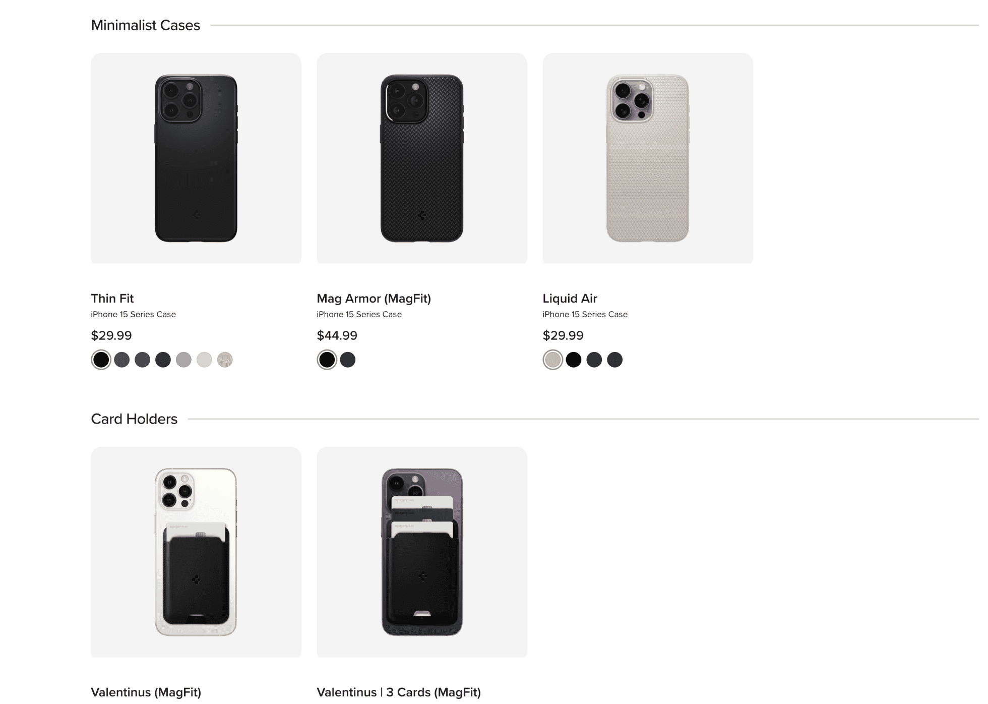
Clear categorization on product listings.
as-is
Product listings without categories and cohesive style make it difficult and overwhelming for users to find what they want.
Grouped similar types of products and unified the style of images for easier browsing and quicker decision-making.
Solution 3
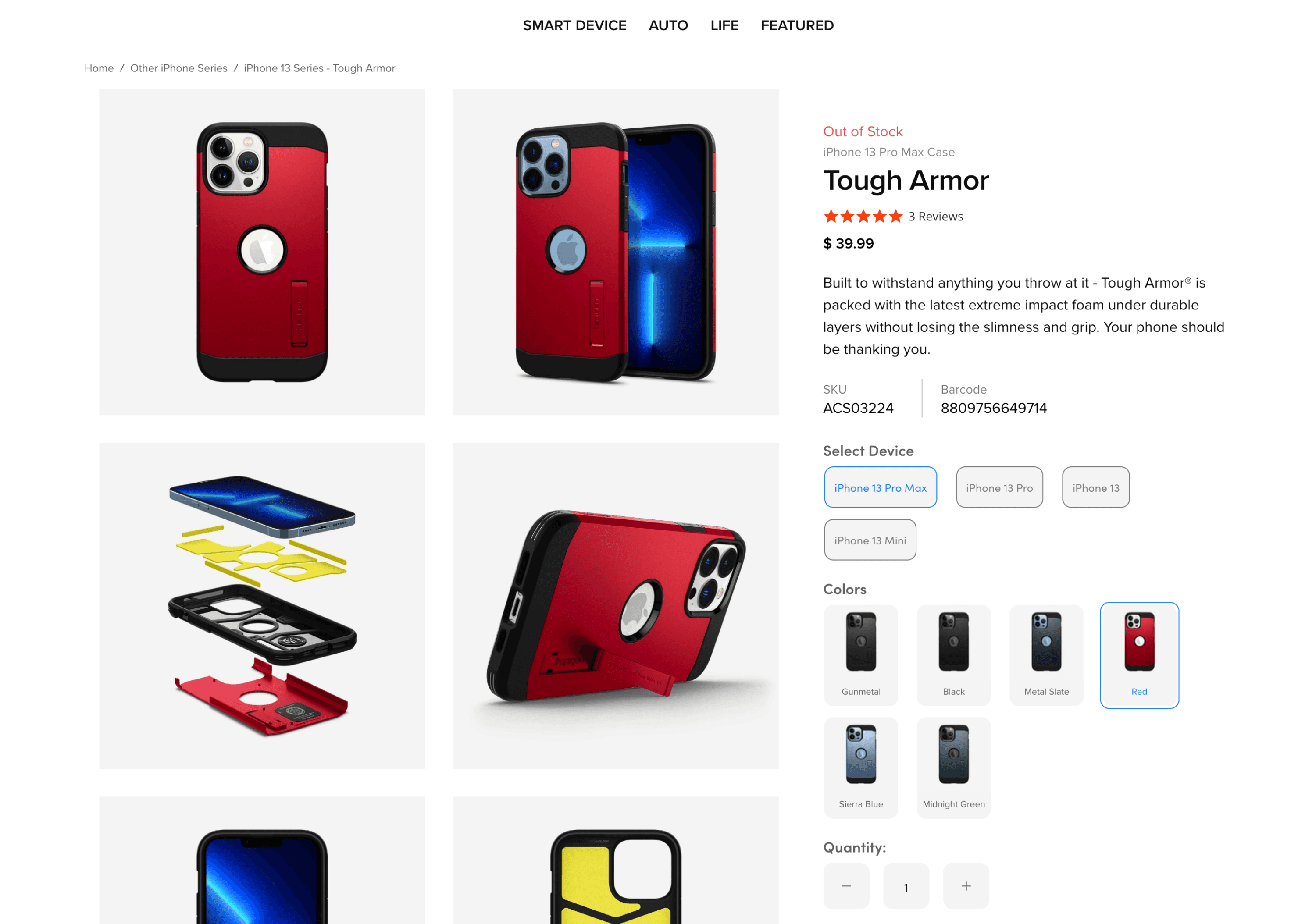
Expanded product image display.
as-is
Users need to manually click on the arrow icons to view the carousel images.
to-be
Users can view all images at once and still click on them for a zoom-in.
Solution 4
Improved mobile readability.
as-is
to-be
solution
Moved the prior information to the top.
as-is
Important product details are buried at the bottom, making them hard to find.
to-be
Key details are placed at the top.
solution
Simplified the complicated flow.
as-is
iphone 13 pro max / case page
iphone 13 series / case listing
iphone 13 pro / case page


